
Toning is one of my favorite aspects of editing a photograph. It can be oh-so-fun! It relates to the manipulation of the colors in your photograph. Although, it once most often related to black and white film photography, now people use toning to add a sense of fantasy to their digital photographs as well.
It is one of those photographic elements that you can use to build upon your own style. The best thing you can do to figure out what toning fits you well or fits a certain photograph well is to go through and try out different combinations. When doing this focus on your standard color wheel and on matching primary colors. These combinations usually work the best.
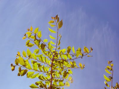
I started out with a photograph of tree leafs, which I modified slighting in terms of brightness and contrast.

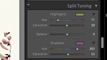
Then I used my Adobe Lightroom 2 program (you can download a free trial by clicking here). I used both the white color balance and split-toning option bars.
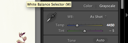
Higher temperature with yellow highlights and green shadows:

Purple highlights and red shadows:

Blue highlights and green shadows:
Purple highlights and blue shadows:

You can also use split-toning to spice up your black and white photographs.
Higher temperature while in grayscale with yellow highlights and magenta shadows:

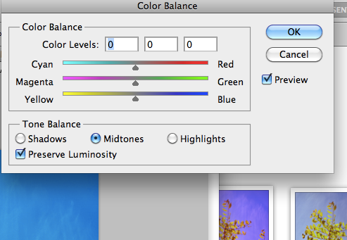
To split-tone in Photoshop, you can use the color balance option bars by scrolling to your adjustment options and clicking on color balance. Photoshop allows you more toning options than Lightroom, though options in toning can actually be a bad thing when you're trying to narrow down a print.
1 comment:
I love the look of the last one.. thanks for the tip!
Post a Comment